Meet Handsme!
Meet Handsme!, an app dedicated to buying & selling childrens clothes online, in a safe and secure manner!
Handsme! has been in development from January 20th, 2025, to April 1st, 2025.
The problem at the base was that buying childrens clothes can be a very consuming activity, both money & time wise, and then, as the child outgrow them, parents are left with a lot of unused clothes that have no more use for. Handsme! aims to solve that problem.
As this is my first project, my role is being an all around UX designer. From conceptualization to the final product, every aspect of this project has been done and supervised by me.
Due to limitations in direct user interviews, I conducted a competitive analysis of secondhand clothing platforms and explored user reviews and parenting forums. I identified common pain points and expectations for a smoother buying/selling experience.
Key findings:
Parents struggle to find the right size quickly
Trust issues with secondhand clothes.
Selling is time-consuming.
A better search/filter system is needed.
Users want seller ratings & detailed descriptions.
A fast listing process (photo + auto-description) would help.
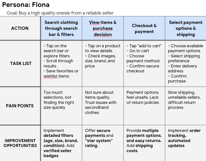
So, I created the Persona of Fiona Brown, a nurse and a new mother.
She lives in Chicago, Illinois, with her husband. She’s always been an hard worker, unstoppable, but having a baby forced her to slow down, and she began to focus on the expenses revolving around her child. Clothing, in particular, is an issue: her child outgrows her clothing from one month to the next, and she’s looking for a way to optimize her time and budget, without having to compromise on the quality of the clothes.

With my main Persona set & done, I went deep down into the User Journey, which I will condens in two tabs below:

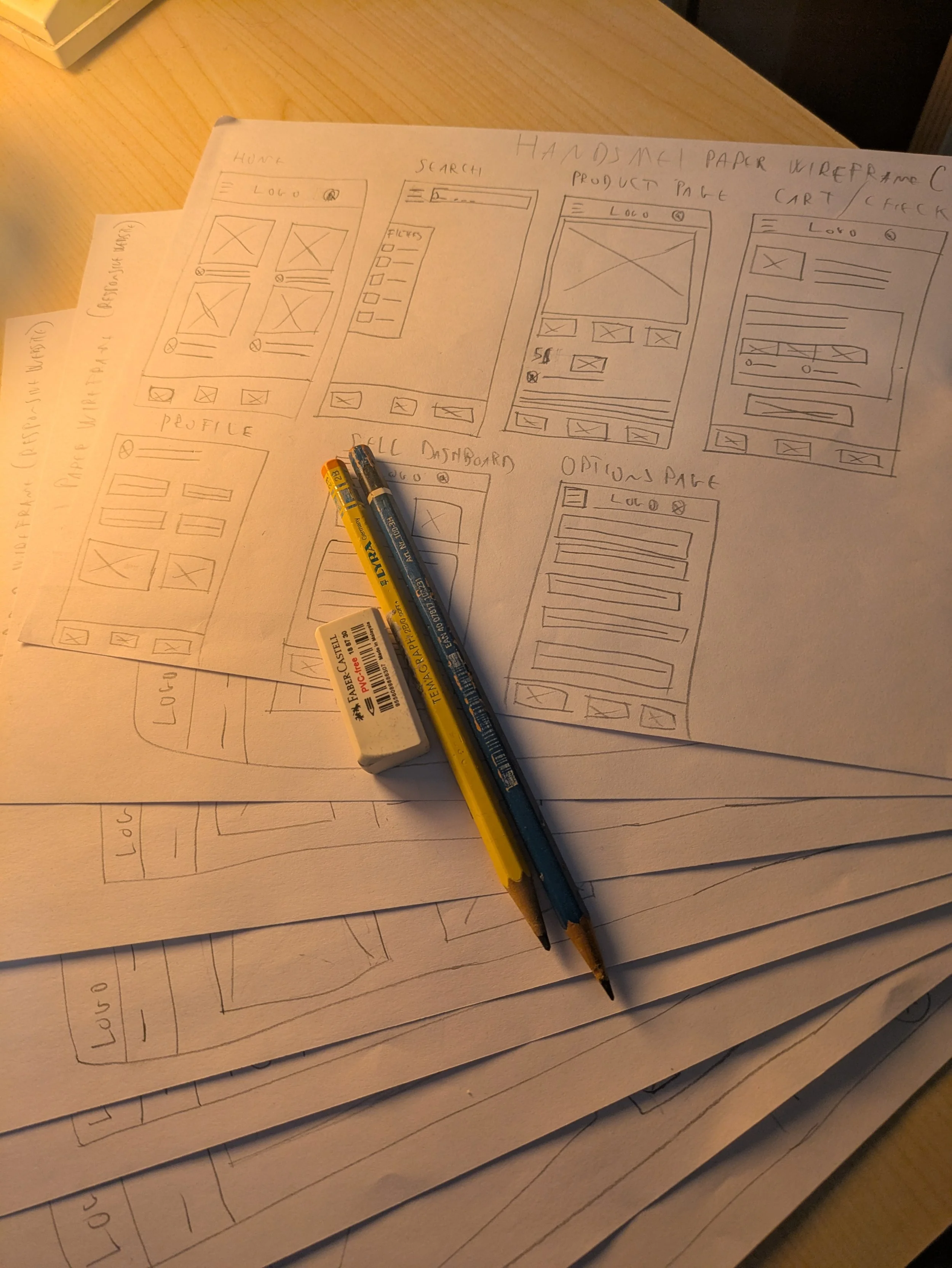
So, with the User Journey in hand and a pretty good idea of the User Flow in my mind (by exploring two other giants of e-commerce, Amazon & Vinted), I sat down and grabbed a pencil, creating the first ever paper wireframe of Handsme!
But then, the real challenge arrived: figuring out Figma. It wasn’t easy at all, and I had my fair share of misteps, but in the end, I manage to turn some whimsy Lo-Fi prototype into something completely different - as shown below:
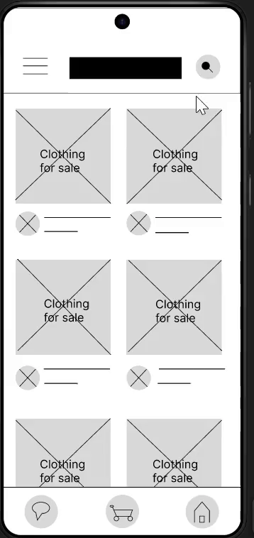
The “Lo-Fi Buying Flow”, which also taught me about how to make buttons actually work …
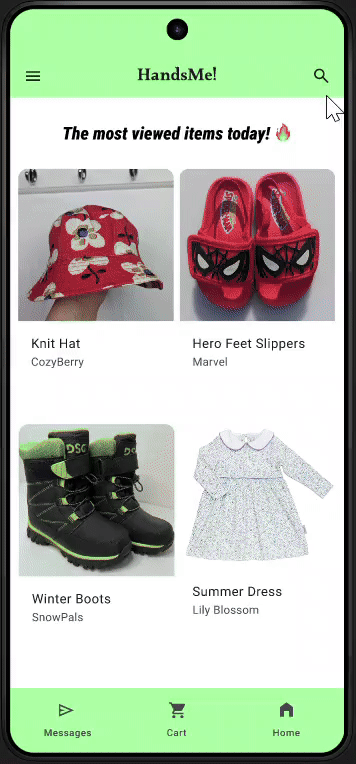
… and the “Hi-Fi” one, with a much more clearer identity and style, simple yet effective.


Above, two differents “before - after” of both the main home page & the profile page. Keeping the similarities going was my main priority, using the Lo-Fi version as an anchor to not lose myself too much in the process of making everything look the best, but focusing on functionality, ease of use and reduction of stimuli as much as possible.
What I’ve learned during the process:
One of the main factors (and errors …) was focusing too much on what was working and the user flow, losing track of other key elements. One such element was something that was pointed out to me when I ran a test for users, and that was the lack of a delete button.
My mind was shattered. How could’ve forgotten something so crucial? Luckly, adding a “delete” button was easier than anticipated, and I’ve managed to make it work well.
The lesson was learned: no matter how much you think you have things under control, you must always have an input from the outside to see the bigger, clearer picture, and it’s something I won’t forget easly.
Hope you enjoy this reading as much as I enjoyed making it, and see you in the next project!